
The Application Builder in the COMSOL Multiphysics® simulation software offers almost unlimited freedom in the design of apps. But as engineers, we need to balance our creativity with focus to avoid disorder in our simulation app design. In the first installment of a two-part blog series, we give a few guidelines that will help you create apps with a clear, streamlined design and structure.
Providing a Better User Experience for Simulation Apps
The Application Builder enables you to build apps based on existing models that include user interfaces (UIs) for specific purposes. For example, a very simple app may allow the user to change only a geometrical dimension, such as the length of an electric motor, and press a button to compute the simulation results, such as the power and torque for the electric motor.
In the design of app UIs, the Form Editor and Method Editor in the Application Builder offer almost unlimited freedom. However, we as engineers need to follow some guidelines to create straightforward and effective simulation app designs. The UI of an app should be clearly and pedagogically organized so that the user understands what he or she is supposed to do with the app, and why, with a minimal need for instructions.
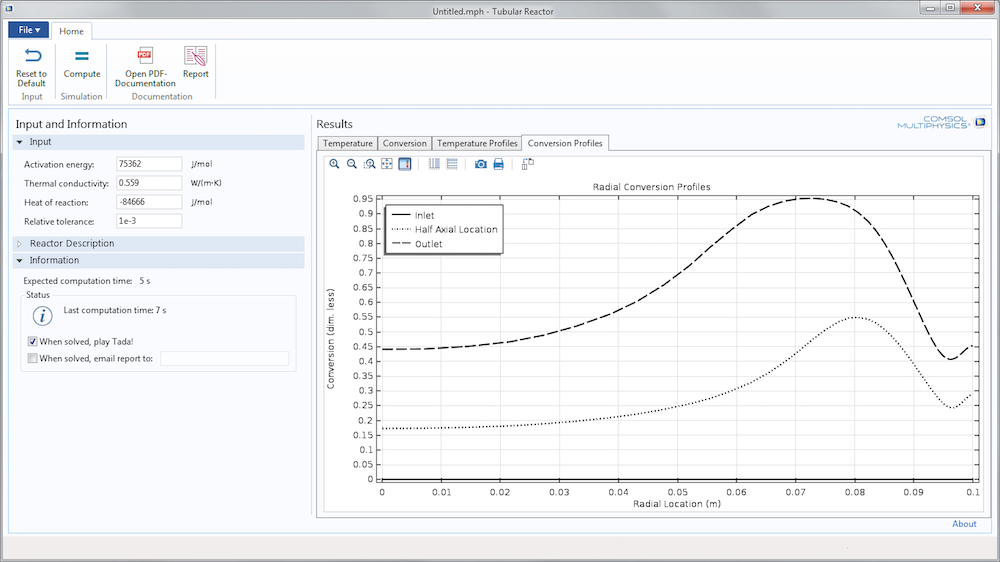
Figure 1. An educational app for modeling tubular reactors with radial and axial composition and temperature variations. Students can vary a few parameters, compute and study the simulation results, and create a report from their studies, all with minimal instructions.
Through my experience reviewing the demo apps included with the Application Library, I have come up with some general tips for creating functional app UIs. Read on to learn how to build apps with design and structure in mind.
Make Creative and Conservative Graphic Design Choices
When building a simulation app, we should be creative, but with purpose. User interfaces are a means for controlling an app’s operations. Therefore, the graphical design should not draw any attention away from the app itself.
As COMSOL Multiphysics users, most of us are engineers, not designers. This means that we should not try to invent new user interface designs unless we have a very good reason and a lot of resources for doing so. We want the design to look modern, but we should stick to the standards of the relevant operating systems. For Windows® operating system and Mac OS, business-oriented apps should follow the look and feel of the operating systems in a fairly strict way.
Use Well-Known Design Standards
By following certain design standards, we avoid potential confusion and create comfort in the app user. Take advantage of what the user should already be familiar with regarding user interfaces and they will feel as if they are traveling well-known terrain. This is why we should always keep standard menus, widgets, and buttons in their standard positions, if possible.
For example, Windows® and Mac users won’t think twice about the position of the main menu and toolbar. They know that the top horizontal toolbar contains the most general and important commands. The most frequent and basic commands are placed to the left, so the upper left corner of the UI is usually considered the most important position. I have seen apps where the main toolbar is placed at the bottom or vertically to the right of the window to minimize mouse movement. However, designing an app that aligns with the user’s expectations is more important. In another example, we expect to find Save and Save As in the File menu and OK and Cancel buttons in that order, not Cancel and then OK. The size of UI components, widgets, and buttons is also standard for Windows® and Mac apps.
Keeping your spacing and positioning standard for these items is also important. It is very easy to make a user interface look unprofessional if there is too much or not enough space between forms and widgets or if the spacing is inconsistent among forms. Forms are most often aligned to the left and filled from top to bottom. Also, if you look at professional apps, they often only leave white space to the right of a form collection or below the main section of the UI.
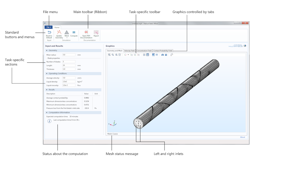
Figure 2. The Helical Static Mixer app follows design standards well. Note that the Graphics toolbar (task-specific toolbar) is inside the Graphics form. The Graphics toolbar could be vertical, since this is not unusual for task-specific toolbars in Windows® and Mac apps.
Figure 2 shows an app for modeling helical static mixers of different sizes and configurations under different operating conditions. You can see that the UI for this app is clean and the position of the input and commands follows the standard for most Windows® and Mac apps. The size of icons and menus and the spacing between forms and widgets also follows consistent standards. White spaces are only found to the right of forms and widgets or below a main section of the UI.
Create Structure with Task-Specific Sections
To achieve a functional design, divide the app UI into task-specific areas. These specific tasks can be clearly stated in each section’s title. In the app shown in Figure 2:
- Important commands are in the main toolbar (the ribbon in Windows®), each with their own section
- Text and number input and output forms are to the left, each with their own task-specific section (in the Input and Results form collection)
- All graphics output is in the Graphics form collection, each with their own task-specific tab
In this app, each task in the main toolbar has its own sections: Input, Simulation, and Documentation. The Input and Results form collection is also divided into sections with forms that contain headers and internal hierarchy, including Geometry, Operating Conditions, Results, and Computation Information.
It is tempting to gather all input, output, and graphics output for one task in one form. I have seen apps where the geometry input and the graphics geometry output are in one single form, while the graphics output of the simulation results is in another area of the UI. It’s confusing to mix inputs and outputs in different areas throughout the UI, even if they correspond to specific tasks. A better tactic is to place similar inputs and outputs in the same place; i.e., all graphics output in one Graphics form collection, as in Figure 2.
The computer screens that we use today are large and have a high resolution, which makes it tempting to put all inputs and outputs onto one screen. However, even if there is enough space on the screen, the view may be hard to process. We should therefore consider using form collections to put different inputs and outputs on different forms and show them one at a time.
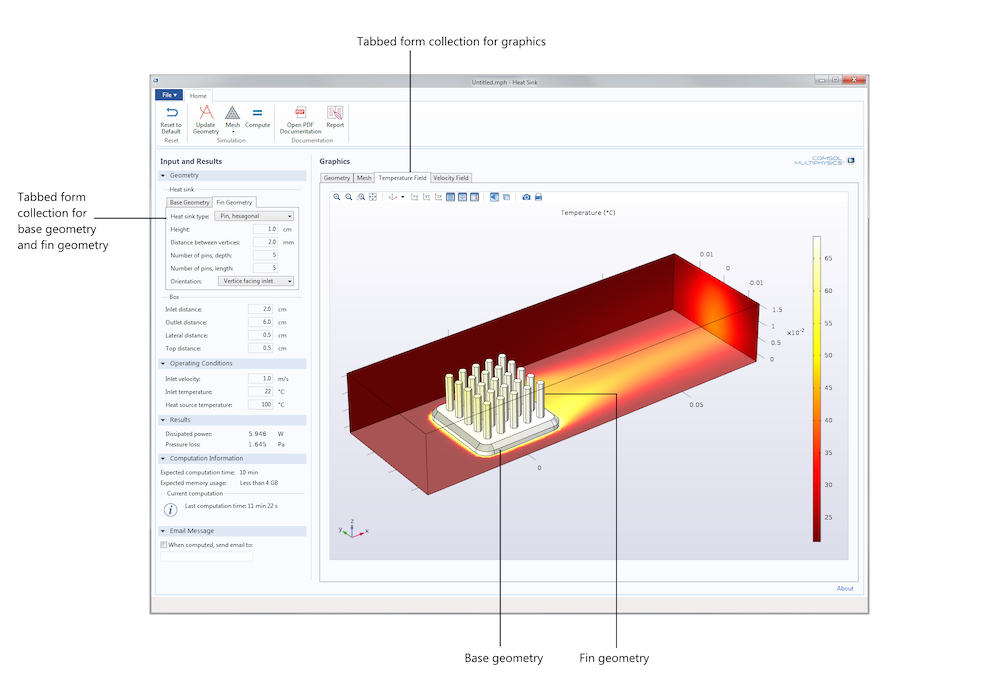
Figure 3. Tabbed form collections and combo boxes may be used to show one screen at a time to avoid cluttering and cramping the user interface.
Figure 3 above shows the UI for an app for the modeling and simulation of a heat sink used in electronics cooling. The Heat sink geometry input form collection is a tabbed form collection with one tab for the Base Geometry input and one for the Fin Geometry input. Although there is space to show both input forms, showing one form at a time makes the UI clearer and easier to overview. Here, we should consider a tabbed form collection for the entire Input and Results form collection, since even with a tabbed form collection for the heat sink geometry, the UI still looks a bit overloaded.
Tabbed form collections and combo boxes are beneficial because they let users know that there are alternative inputs and information to the currently selected tab. We should avoid using buttons to do the same job as tabs and combo boxes, as this is not an intuitive use of buttons. Using alternative forms behind tabs and combo boxes results in a clear and clean design and can help to avoid overloading a form.
The same strategy may be used for the main toolbar, the ribbon, in Windows® apps. The ribbon allows for grouping commands under different tabs to give a good overview and at the same time, avoid overloading the main toolbar with menus. Figure 4 shows an app for simulating mixers, where the mixing is achieved by baffles in combination with central impellers. The ribbon for the Mixer app contains two different tabs to avoid overloading the main toolbar: a Home tab with the general commands and an Impellers tab, which is a task-specific tab for adding and defining impellers. In addition, the Input and Results form collection is tabbed to separate the impeller input with the more general inputs for the mixer.
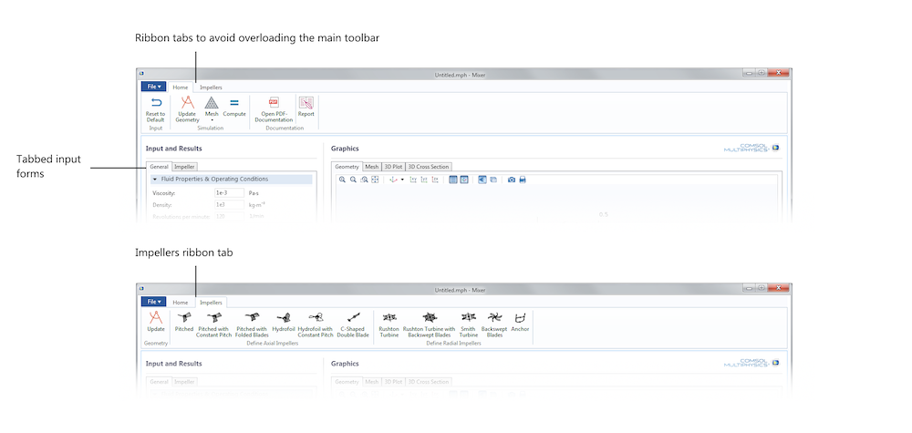
Figure 4. The two ribbon tabs in the Mixer app.
Be Consistent with Simulation App Design and Structure
By using the same or a similar base structure with all of our apps, the user doesn’t need to learn how to navigate a new structure for each app that we create. As mentioned above, putting similar inputs and commands in similar places brings clarity. We can put the graphics area for different graphics outputs in the same position by using tabbed form collections to separate the different graphics outputs.
If we look at the Helical Static Mixer and Heat Sink apps discussed above, they require the same commands: Reset to Default, Update Geometry, Mesh, Compute, Open PDF Documentation, and Report. Note that if we build apps with completely different purposes, we may need different designs.
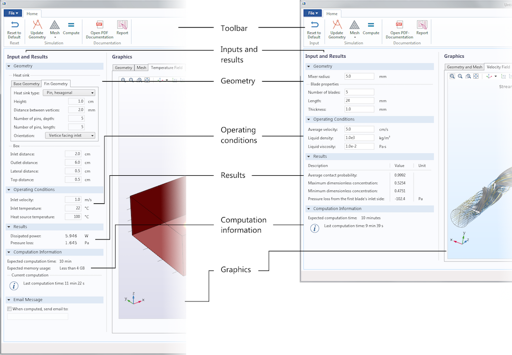
Figure 5. The UI of our Heat Sink app, left, compared to the Helical Static Mixer app, right. The ribbon is identical, since both apps require the same commands.
Consistency is also very important when it comes to text, colors, shapes, and icons. For example, we immediately recognize the PDF File icon in the toolbar above. We can be creative with icons and colors, but we also have to take advantage of what the user already knows and stay consistent with other software and our own design. In the Application Builder, we have access to all of the icons in the COMSOL Multiphysics software for use in our apps, though it is important that we use these icons in the way that they are intended. If a COMSOL Multiphysics user comes across an app and the icons are used for commands that differ from their original purpose, it could become very confusing.
Consistency in descriptions and command text is also often overlooked. For example, the commands in the toolbar above are all written in imperative form for analogous operations, such as Reset, Update Geometry, Mesh, etc. The input fields, however, contain descriptive text; i.e., Length and Thickness. They are not written as commands; i.e., Set Length and Set Width. These commands are not technically wrong, but the inconsistency in tense is confusing. All of the smaller details may seem obvious, but I have seen apps that mix these types of command formulations and descriptions, which creates a negative first impression for the user.
We can also use font types and colors to guide the users as they explore the app. For example, in Figure 6 below, the gray text and bold font type implies that the Inputs and Results and Graphics form headings are at the same hierarchical level. The lighter font and colors in Geometry, Operating Conditions, and Results show that these forms are at the same level and that they are one level below the Input and Results form. In the same fashion, Heat sink and Box are at the same level, yet another level down from Geometry. Consistency in capitalization also reveals order and hierarchy: Operating Conditions is fully capitalized, while Heat sink is not. These small details may, of course, be different for different software types, but it is important to be consistent within an app and between all of our apps.
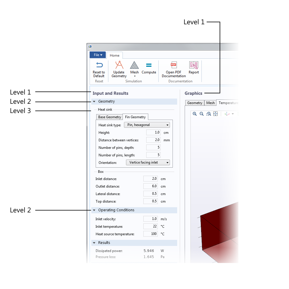
Figure 6. Consistency in fonts and colors brings structure to the user interface.
Summary of Simulation App Design Tips
To summarize our discussion, here is a checklist of the rules that I always follow when designing an app’s user interface:
- Be consistent with design and structure by using common standards and placing elements where users expect them.
- Use a clear hierarchy so that browsing a heading level is enough information to know what is in that section.
- Use the same structure for a collection of apps, if possible.
- Frame sections and forms or use divider lines to show a clear distinction between different user interface components.
- Align user interface components, such as form sections, headings, buttons, input fields, output fields, and other widgets to create a feeling of order.
- Use standard sizes for widgets. For example, large buttons may be good for touch pads, but they do not look good in UIs for Windows® and Mac.
- Be very thorough with spacing and positioning.
- Use colors only when required to signal structure, hierarchy, or to highlight important messages and commands.
- Use few font types (operating system fonts, if possible) and avoid serif fonts, as they do not look good in user interfaces.
These tips will help you avoid the two common pitfalls that I have encountered when reviewing multiphysics modeling apps:
- Apps that look old: Designs should look current, not outdated.
- Apps that look odd: Designs should look professional, not homemade.
With the guidelines discussed in this blog post, you will be building apps with an improved design and structure in no time. Stay tuned for our second part to this blog series in which we will discuss how to optimize workflow and user experience for your simulation apps.
Further Resources
- Check out these blog posts about some of our demo apps and apps designed by other COMSOL Multiphysics users:
- Watch this introductory series of tutorial videos on how to use the Application Builder
Mac and Mac OS are trademarks of Apple Inc., registered in the U.S. and other countries.
Windows is either a registered trademark or trademark of Microsoft Corporation in the United States and/or other countries.




Comments (0)