
In the first part of this blog series, we focused on designing a user interface with an ordered and clear structure. Today, we discuss tips for designing apps with an enhanced workflow and user experience. Learn about how to improve user workflow in your simulation app through structure, tooltips and warning messages that provide information, and more.
Build an Intuitive Workflow Path
As we mentioned in the previous blog post, the structure of an app should speak to how and why an app should be used. An app’s user interface (UI) structure should also suggest the order of tasks. When one task is complete, the design should implicitly suggest the next step (or with wizards, explicitly suggest the next step). For example, the main toolbar in our app may reveal that we start by updating the geometry, continue by creating the mesh, click on the Compute button, and generate the simulation report. The Input and Results form collection suggests that we start by defining the geometry input and operating conditions, and then (after Compute), we can study the results.
Such a structure is easy to obtain in a simple app, but we should note that the user interface in the COMSOL Multiphysics® software follows the same workflow path for the simulation process, which is left to right and top to bottom. This is consistent with the way we read Western languages. If the COMSOL software had been created in an Arabic-speaking country without exposure to Western software, then the workflow could well have been from right to left.
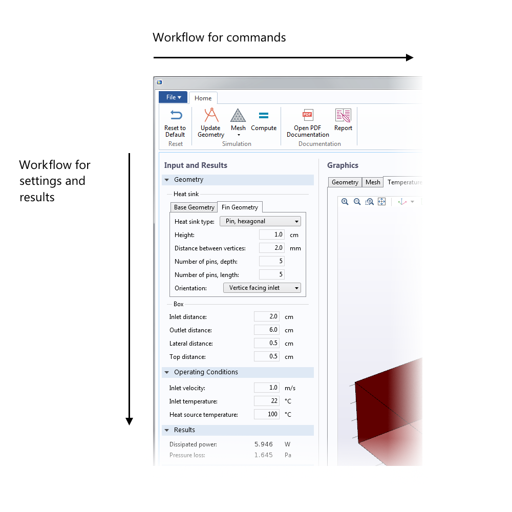
Figure 1. The main workflow path travels from left to right and top to bottom.
Foster Control and Focus in App Users
Although the UI design should guide users through the simulation app, they should feel in control of the modeling process. The implications of an input or command should be transparent, and a change in input should not lead to unexpected changes elsewhere in the simulation.
At the same time, users may need help operating simulation apps. In the Helical Static Mixer and Heat Sink apps exemplified in this blog post, all input fields are equipped with checks, so that if there is a typo in the user input, it is immediately conveyed to the user. In addition, each input field has a tooltip so that the user has assistance with the limits for different inputs, instead of having to read annoying error messages later.
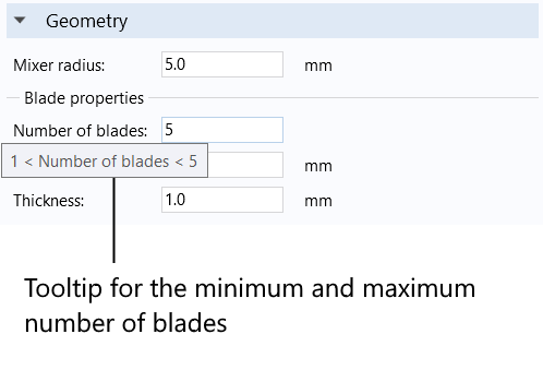
Figure 2. The input fields in the Helical Static Mixer app include tooltips that tell the users the limitation and validity of the model embedded in the app. Here, a tooltip tells users the validity interval for the number of helical blades inside the mixer.
I have encountered apps where I happily proceed through the modeling process, just to select Compute and get an error message about a typo that I entered very early on in the process. It is better to immediately tell users when there is an input error, so that they feel in control when clicking on the Compute button, not anxious. Let’s save the adrenaline rush for their ski vacations or whitewater rafting trips.
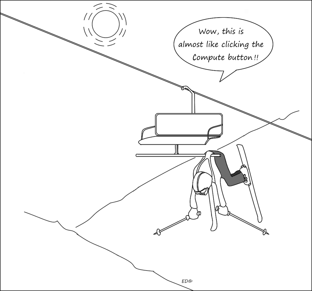
Figure 3. App users should not feel anxiety when they are about to click the Compute button. This is probably not a sign of a positive user experience.
It is also a good idea to inform users about the expected computation time, so that they know what to expect when clicking on the Compute button, as shown in the Simulation Information section in Figure 4.
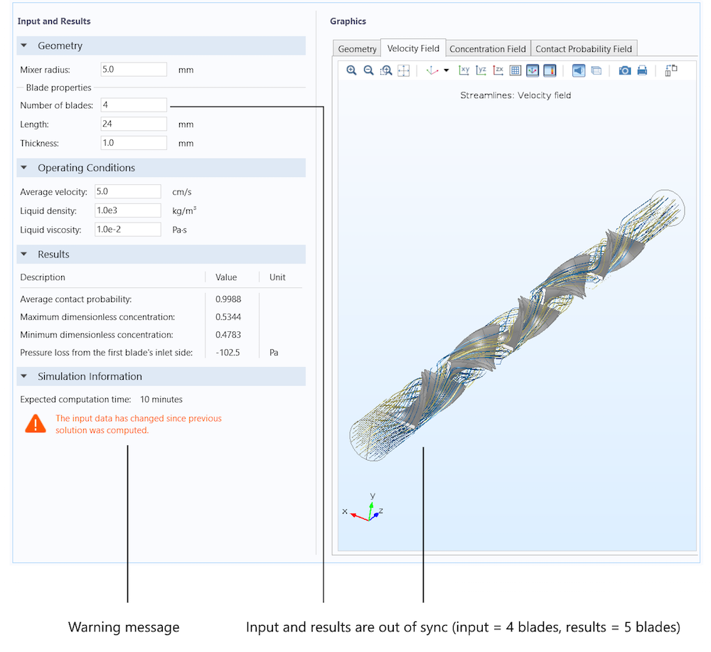
The app should also inform users about the status of the input and the results of the computation. If a user changes an input that influences the displayed results, they should be notified. One very explicit way of doing so is with icons and colors. For example, in the Helical Static Mixer app, a warning message in red tells users when the simulation results are out of sync with the input, as shown in the figure below. This is on the verge of being annoying and a less prominent warning message should be considered, depending on taste. Either way, it is important that users know about these types of issues.
Along the same lines, if we try to create a report when the input and output are out of sync, the app issues an error message. The reason for this error message is that the app is not able to perform double bookkeeping of the inputs, so if we change the input after Compute, it would generate the wrong figures and results in the report.
Note that we should be very careful when using warning messages and colors, especially the color red. Too many warnings and colors create a feeling of disorder in the simulation app.
Figure 4. A warning message that the computation is out of sync with the input. Here, the number of helical blades was changed from 5 to 4 in the input, but neither the geometry nor the simulation results have been updated. The expected computational time is also displayed on the app’s UI.
If a user makes a change in an input and gets an unexpected result, such as a sudden shift of a window’s position, they may get distracted or lose their feeling of control of the simulation. If we change an input form (for example, by using a combo box), then the different forms should be as similar as possible in size and structure. This way, they only highlight the change that is made by the different selection in the combo box, focusing the user’s attention. For example, changing the Heat sink type combo box in the figure below only changes the description of an input field and adds an Orientation combo box. The rest of the inputs and descriptions are in exactly the same place. The whole Fin Geometry form also retains its size during the change of the heat sink type. If we oversee such details, a change in size leads to the entire window shifting positions, which immediately confuses the user and leads them to believe that something other than the intended task was changed.
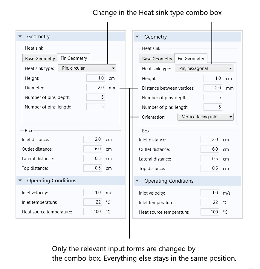
Figure 5. A change in the Heat sink type combo box only changes the relevant input forms. Everything else stays in exactly the same position. This highlights the change and avoids distracting the user.
Adapt the App UI to Intended Platforms
Most multiphysics modeling and simulation apps are designed for use on the Windows® operating system, Mac OS, or Linux® operating system on desktop and laptop computers. The screen size and resolution for these operating systems may vary substantially, especially if we are also planning to run the apps using projectors. Therefore, we should always consider different screen sizes and resolutions when designing our apps.
App windows should be resizable and scroll bars should be available for low-resolution screens. However, when we change the size of the app window, we do not want number and text input or output forms to change in font size or rows and columns to change distance (the column width may change, but not the distance between columns). We have to be careful and only resize forms that need it. The ability to resize graphics output forms and column widths in tables might also be beneficial.
While it is important to enable users to control the size of the app window, keep in mind that the app should still look aesthetically pleasing and give users a sense of control. User interface components should not regroup and reposition, unless this is intended, as the user should not be distracted by irrelevant changes when resizing the window.
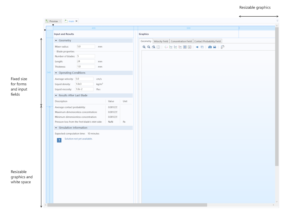
Figure 6. The Application Builder allows you to specify which forms and form columns should be resizable.
Always Check the Simulation Results
Great apps require that the embedded model is defined correctly and that the numerical model equations are solved with the desired accuracy. In order to build a useful app, we should always make sure to:
- Verify the mathematical model equations.
- Are the equations correctly defined in our model?
- Validate the solution to the numerical model equations.
- Does the solution describe the phenomena that we intend to describe?
- Where does the model cease to be valid?
- Estimate the accuracy of the solution.
- A mesh convergence analysis may give us a hint.
You could design the greatest simulation app in the world, but if it doesn’t meet the above requirements, the app will serve no purpose.
Checklist for Optimizing Workflow in Your Simulation App Design
We can condense the guidelines described in parts 1 and 2 of this blog series into a simple checklist for your own app creation process:
- Use a minimum number of fonts and colors, except for the graphics results. No serif fonts.
- Follow the look and feel of the intended operating system.
- Avoid nonstandard sizes for UI components, widgets, and buttons.
- Place user interface components and widgets where users expect to find them. For example, place the main toolbar horizontally at the top of the window.
- Create a UI structure that reveals the flow of the modeling and simulation process.
- Avoid clutter and use tabbed form collections and combo boxes to avoid overloading the app window. Do not use buttons or other nonstandard widgets for changing tabs and forms.
- Space and position the components and widgets with thought and care.
- Align the user interface components vertically and horizontally.
- Use divider lines and frames around forms and widget groups to convey structure.
- Include information about expected computation time, actual computation time, and the status of the input and results (in sync or out of sync).
- Include safe input/output control behind input fields and commands. Include checks for bounds in input fields to tell users immediately when things go wrong and do not generate reports.
- Include tooltips and help options.
- Test the app on the intended platforms and screen resolutions and make the app window resizable in a consistent way, if needed.
- Use thumbnails and descriptions for use in the COMSOL Server™ product.
Further Reading
- Read part 1 of our blog series to learn more tips for improving simulation app design and structure
- Check out a blog post on 7 ways to use the Application Builder and COMSOL Server™
- Find an upcoming workshop in your area to further develop your simulation app design skills
Windows is either a registered trademark or trademark of Microsoft Corporation in the United States and/or other countries.
Mac OS is a trademark of Apple Inc., registered in the U.S. and other countries.
Linux is a registered trademark of Linus Torvalds.



Comments (0)